Make the app yours
Interface colours, light or dark, the workspace background, the selection outline, and resizing or folding away the panels.
Interface colours
Open Settings (the gear, top right) and scroll to Interface colours. Every change applies at once and is saved, so you can try things and watch the whole app change under your pointer.
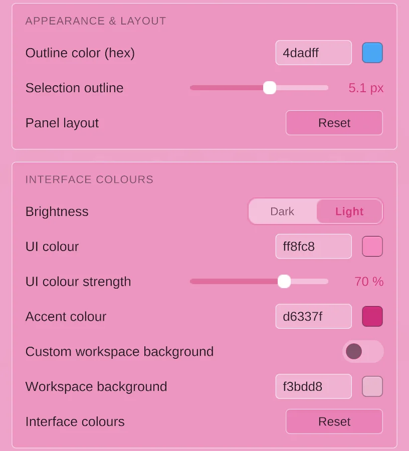
- Brightness: Dark or Light panels.
- UI colour: the colour the panels are tinted with. It stays deep in Dark and pale in Light, so text stays readable. None keeps the plain grey look.
- UI colour strength: how colourful that tint is.
- Accent colour: selected tabs, switches, highlights and the active tool. Gold by default.
- Custom workspace background: turn it on to give the 3D view its own colour instead of following the panels.
- Interface colours → Reset: back to the original look.
Type a hex code like 6E3FD1 into a field, or click the swatch next to it for a picker. Pictures, thumbnails, colour swatches and your pet itself always keep their real colours, and warnings stay one clear orange whatever you pick.
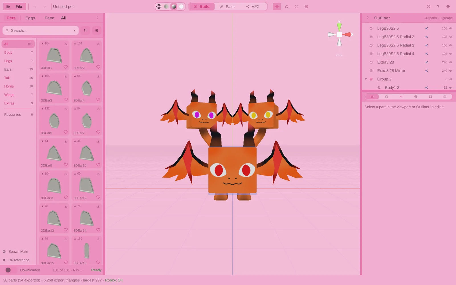
The app warns you under the fields if a choice will be hard to read, for example a grey accent that makes selected tabs look like plain buttons.
Selection outline
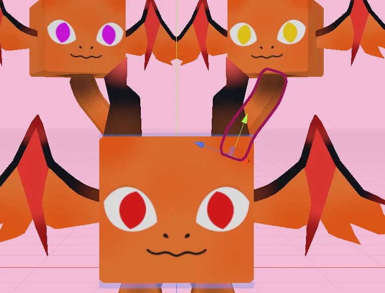
Under Appearance & layout, Outline color sets the colour of the outline around selected parts, and Selection outline sets how thick it is. A bright, thick outline is easier to see on busy pets.
Panels
Drag the thin divider at the edge of the library or of the right-hand panels to make them wider or narrower; the library’s cards grow to fill the space. Drag the line between the Outliner and the tabs below it to give either more height. Double-click a divider to put it back.
Click the small arrow at the top of a panel to fold it away and give the 3D view the whole window. A thin strip with an arrow stays at the edge; click it to bring the panel back.
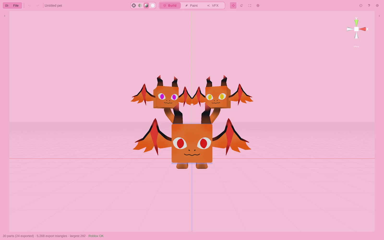
Panel layout → Reset in Settings puts every panel back to its original size and opens any you folded away. The app remembers your layout between launches.